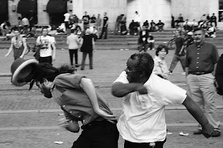
RAGE
Denotation
Rage is to have angry fury or violent anger. The man pictured below is frustrated on the phone and fulfills the definition of having angry fury.
Connotation
This is what first came to mind when I thought of rage. War and fighting are things that result from rage. Someone angry enough to hit someone in the face definately fulfills the definition of having violent anger.
ORDER
Denotation
Order can mean sequence or authoritive instruction. I defined order with an image of the president because this is an example of authoritive instruction. The president maintatins order in the United States.
Connotation
The first thing that comes to mind when I think of order are single file lines and obedience. I have found an image of some young men walking in two single file lines to military school.
JUSTICE
Denotation
Not only is this the widely recognized symbol for justice and the judicial system, it very well demonstrates the definition of justice. Justice is the maintenance of rightfulness or lawfulness and a balance does just that. A balance maintains the equilibrium. In the case of justice, it is maintaining the equilibrium of the law and of right and wrong.
Connotation
When I think of justice, I think of Superman who keeps the city safe and takes care of all evil. He maintains the "balance."
EVIL
Denotation
Evil is morally wrong, bad, or wicked. I think that fire can be used as a symbol for evil because it can kill and burn houses and alot of the time it symbolizes hell.
Connotation
When I thought of evil, the first thing that came to mind was Hitler. He was such a horrible person and he was evil for the crimes he committed.
PEACE
Denotation
This is the standard symbol for peace and is widely known almost everywhere. Peace is defined as serenity and harmony.

Connotation
Although peace can be a variety of different things, I tend to think of tree-huggers when I think of this term. The majority of the people that are die-hard advocates are typically tree-huggers.

GOD
Denotation
God is defined as the supreme being and creator of the universe. The best imagae I could come up with to denote this term is a pair of hands holding Earth with the ability to do anything they want with it.

Connotation
When I think of God, I think of heaven and the absolute beauty of it. Many times, when I see the sun shining through parting clouds I think of it as heaven.

HISTORY
Denotation
History is broadly defined as past events. There is an immeasurable number of pictures that could be taken show a past event so, the picture I chose is of clocks showing time. These clocks represent past events that occured at past times.

Connotation
When I think of history, I think of school and textbooks. I think of how boring it was to memorize dates and names of people. History was definately not my favorite subject in school.

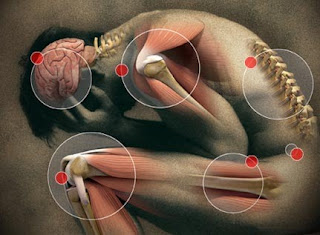
PAIN
Denotation
The definition of pain is physical suffering and distress. This is the best image I could fine to show what physical suffering is.
Connotation
The first thing that came to mind when I thought of pain was a band aid which is the adhesive strip used to heal wounds, etc.

SMART
Denotation
The word smart is defined as intelligence and mental capabilities. There is no line that a person can draw to determine someone as smart or not. However, being "smart" is a direct function of the brain.

Connotation
When I think of smart, I think of the stereotypical "smart person." This, to me, would be the nerds that attend universities and do alot of homework.
 A couple of girls were lost and confused in life. They decided that they must find out what was to come in their futures.
 They found the nearest psychic and he proceeded to tell them what the near future had in store for them.
 He told them that a burglar would come to their house in a black hoodie and holding a gun.
 He would threaten to kill their dog...


